Aug 10
Diego Román
Interface and user experience design at White Spell
Hello adventurers! I am Diego Román, Lead 2D artist & UI designer. In this chapter I am going to tell you what the development process of the White Spell interface has been like and what our main concerns have been.
First of all, we must keep in mind that the interface is a really important element in any application. It is an element that participates in the player’s retention phase, which occurs during the first minutes of the game; In this phase we evaluate its aesthetics and decide whether or not we like what we see. But it is also present in later phases, where we evaluate the dynamics and usability of the game itself, and everything that you would have gained by its attractiveness can be lost immediately if the user does not find the information they are looking for or it is confusing.
But let’s go in parts.
Background
The general structure of the information was initially designed by Alexis Alonso, who did a great job taking into account that at that time we were in a time of scarcity and poverty ☹, at this point we got very close to the graphic aspect of the games. typical browser from the 90s, and call me a visionary, but I sensed a possible drawback, we are not in the 90s.
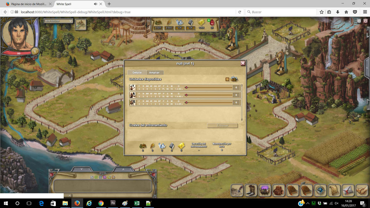
Fig. 1 El aspecto originario…
As you can see, the information was quite crowded and icons were added without any type of control as they were needed, in addition, certain functionalities were also being mixed that it was better to differentiate. It was at this point, when I joined the Hunters team and was tasked with improving the entire interface of the game.
The prototype needed a complete review; it had to be adapted to a simpler organization, with fewer elements and more general groupings. However, I had a great base to start working with.
New references
As in other aspects of White Spell’s development, looking at the genre’s contemporaries was a must. Not only did we have to pay attention to the aesthetic line, but the organizational one, such as the arrangement of the information on the screen, was also important. There is always someone who has already faced the same problems as you and it is not a bad idea to study how they have solved them, even if they had more resources, more people and more time <I write while smiling at the boss>. My advice is to observe, analyze and adapt, ‘everything is a remix’.
Observe, analyze and adapt ‘everything is a remix’.
Diego Román
Process
In relation to the previous point and to expand the depth of my knowledge about this type of games, I downloaded several and started playing; I mean, to analyze a lot of different RTS type games. In my defense I want to add that I did not always analyze during work hours .
But as Morpheo would say, it is different to know the path and to walk the path, so I began to “walk” through one of the information windows, in this case, the technology tree:
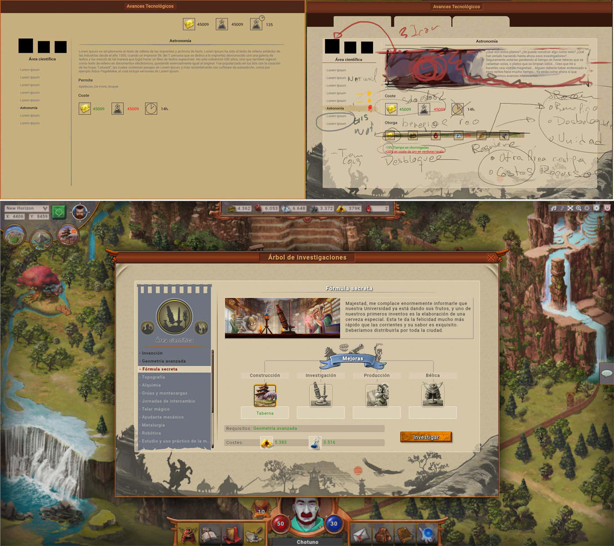
Fig. 2 The style configuration process.
As you can see, after the previous layout, comes the correction in the organization of the information, after which by polishing the textures, texts, contents, decorations and icons, we gradually arrive at the final appearance.
This was the first window of the new and renewed interface and it has determined the general aesthetic line of all the others, and it will surely undergo changes before the launch of the final Beta, since as we progress with the rest of the windows it will disappear. out of phase But the path is made by walking.
Usability
As I have been introducing previously, another point to which a lot of time has been dedicated is to making the interaction dynamics as intuitive as possible, and helping with content where it is not.
For example, in Figure 2, there is a selector on the left side, and the selection information is displayed on the right side. The relationship between the technology icon and the Lore illustration on the right side maintain the same main element, in this case the microscope.
A problem that we have encountered in this window is that most people do not identify that they can choose between 3 different technological branches within it, this represents a real usability problem since it prevents the player from continuing to progress in their adventure.
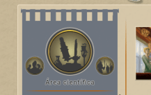
Fig. 3 Technological branches.
Therefore, in the absence of creating a tutorial – a solution that would not help much, since many of us skip it XD – we have created a small animation in the 2 icons at the ends that plays every time we open the interface, with the aim to attract the player’s attention.
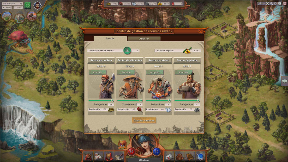
Fig. 4 workers portraits.
In the case of fig. 4 it is simpler, in the resource management center there are four sectors (wood, food, glass and stone), one for each resource and as our building evolves we will enable two extensions of the sector to choose from. Thus, in expanded sectors we can assign more workers to collect said resource.
Graphic content
Without a doubt the coolest part, since if, for example, we want to train new units, it is normal that we first want to see what these units are like. Therefore, in this case we would like to highlight the importance of units within the troop images window. In this way we will not only think about what content our UI should have, but also what should be of greatest importance within it.
This is the case of the new interface that we are developing, fig.5.
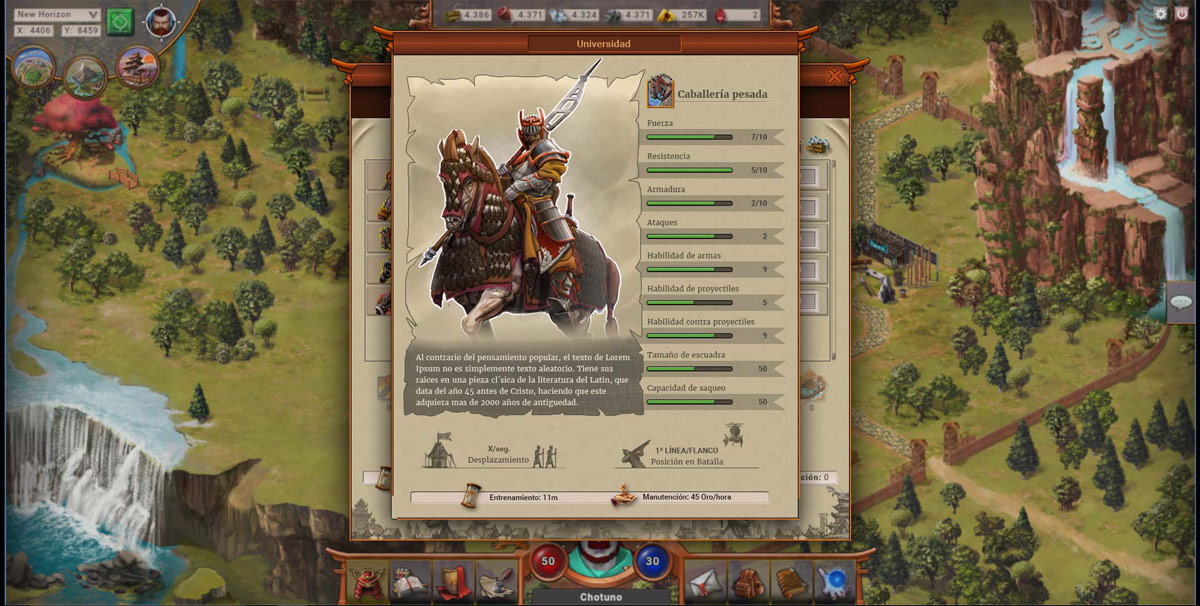
Fig. 5 Troop information.